Colour Drenching in the Bedroom
If you’ve spent any time scrolling through interior design inspo lately, you’ll have seen one trend popping up everywhere: colour drenching. It’s bold, it’s beautiful, and it’s the total opposite of the minimalist, all-white spaces we’ve been told to love for years.
Instead of just adding a pop of colour here and there, colour drenching is all about going all in. Think walls, ceilings, furniture, even soft furnishings, all dressed head to toe in one glorious hue. It’s immersive, cocooning, and surprisingly calming when it’s done right, especially in the bedroom.
So, let’s find out how to bring this confident design trend into your bedroom, and how even your bed — the star of the show — can become part of your colour-drenched masterpiece.
What is colour drenching?
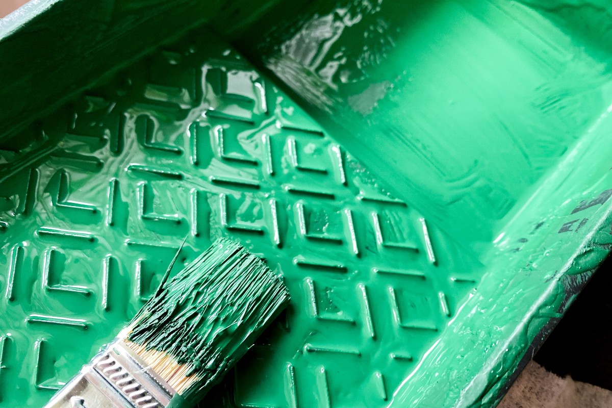
Colour drenching is essentially the idea of committing to one colour and using it across your entire room in varying tones, finishes, and textures. Rather than contrasting or breaking up colour with white trims or neutral accents, you let your chosen hue take centre stage.
You might paint your walls, skirting boards, ceiling, and even your furniture in a similar tone. The effect is immersive. It creates a feeling of being bathed in colour. The result can be cosy and intimate, or vibrant and energising, depending on the palette you choose.
It’s a style that works brilliantly in bedrooms because it helps create a sense of calm continuity. There are no sharp contrasts to jar the eye, just layers of the same soothing shade that help you unwind at the end of the day.
Choosing your perfect bedroom colour
When it comes to choosing a colour to drench your bedroom in, it’s important to think about the mood you want to create. Bedrooms are personal spaces, so the colour you pick should feel right for you — not just one that’s trendy on Instagram.
Here are a few ideas to get you started:
-
Deep Blues & Inky Greens: Perfect for a moody, sophisticated vibe. These tones feel restful and work wonderfully with soft lighting. Pair with velvet or linen textures to stop it feeling too heavy.
-
Soft Terracotta & Clay: Warm, earthy tones that bring a cocooning, Mediterranean feel to the space. Great if you want to culture something that feels a bit more grounded than traditional neutral tones.
-
Dusty Pinks & Mauves: These give a modern romantic touch — still soft and serene, but with a touch more personality than beige or grey.
-
Sage or Olive Green: If you want something fresh but calming, these greens are timeless and flattering in almost any light.
You can absolutely go bold with a striking colour like mustard, plum, or teal, but remember that bedrooms are about relaxation. If you’re worried a colour might be too overpowering, you can always choose a slightly muted version of your favourite shade.
How to layer the look
The key to successful colour drenching isn’t just painting everything the same colour — it’s about layering. You want to add depth, interest, and texture, all within the same tonal family.
Here’s how to do it:
-
Start with your base colour. This will usually go on your walls and ceiling.
-
Add variation in finish. A matt wall paint looks amazing alongside a satin finish on woodwork — the subtle difference in sheen adds richness.
-
Bring in texture. Upholstery, cushions, throws, rugs — they all contribute to the tonal story. A velvet headboard against a matt wall can look stunning.
-
Use lighting wisely. Warm bulbs will make your colour feel richer and cosier, while cool lighting can make it feel fresher and more modern.
Coloured beds: the hero of colour drenching
Now let’s talk about the pièce de resistance; the bed. Too often, the bed is treated as a neutral anchor point in the room: a grey upholstered frame, white bedding, maybe a few coloured cushions if we’re feeling brave.
But in a colour-drenched bedroom, your bed can (and should) join the party. In fact, it’s one of the easiest and most effective ways to commit to the look.
1. Upholstered beds in bold shades
If you’ve opted for a painted wall, consider an upholstered bed in a matching or slightly contrasting tone. For example:
-
A forest green bed, like our Mayver Ottoman bed frame in winter moss, against sage walls creates depth while keeping the palette cohesive.
-
A dusky pink bed in a mauve room feels lush and layered, not matchy-matchy. Our Alexis Ottoman bed frame in pink is just what you’re looking for.
-
A navy bed, such as the Imogen Ottoman bed frame, in a midnight blue room feels cocooning and dramatic.
Choose tactile fabrics like velvet or boucle — they catch the light differently throughout the day and add some dimension to the space.
2. Painted wooden beds
If you love a classic wooden bed frame, don’t be afraid to get out the paintbrush. A painted bed in the same tone as your walls can look beautifully seamless. Try a chalky finish for a relaxed, cottagecore feel, or gloss for something more modern.
3. Bedding as a colour layer
Bedding is another great way to deepen the look. Stick to your colour palette but play with tones and textures:
-
Linen bedding in a lighter version of your wall colour adds softness.
-
A quilt or throw in a darker shade creates grounding contrast.
-
Don’t forget the cushions — mix velvet, cotton, and silk for richness.
The idea is to stay within your chosen colour family but vary the intensity and texture so that the room feels dynamic rather than flat.
A few colour drenching pro tips
-
Go tone-on-tone with care: You don’t need to match everything exactly. A little variation keeps it interesting and more natural.
-
Mind your lighting: Test your paint and fabrics in different lights — what looks soothing in daylight might feel too dark at night.
-
Add subtle contrast: Metallics, wood tones, or natural materials (like rattan or marble) can give your eye somewhere to rest without disrupting the overall scheme.
-
Keep your ceiling in play: Painting the ceiling the same colour as your walls can make the room feel taller and more enveloping.
Why colour drenching works well in bedrooms
There’s something deeply comforting about a colour-drenched bedroom. It feels intentional and serene. No visual clutter, no jarring contrasts, just a gentle wash of colour that wraps around you.
It’s also a surprisingly timeless look. It may just seem like a trend for now, but the idea of creating harmony and depth through tone-on-tone colour has been used in design for over a century (1). It’s so versatile because you can adapt it to suit your own colour preferences — whether that be soft and subtle or dark and dramatic — it’s a style that grows with you.
Colour drenching: final thoughts
Colour drenching isn’t about being fearless with colour for the sake of it. It’s about creating an atmosphere. When you bring the same hue across your walls, ceiling, furniture, and even your bed, you build a sense of calm and cohesion that’s perfect for a bedroom retreat.
So, if you’ve been thinking about giving your space a refresh, why not pick a colour you truly love and go for it? Choose a painted or upholstered coloured bed, drench your walls, and surround yourself with tones that make you feel happy and at home.
Because at the end of the day, your bedroom should feel like your own little sanctuary, and what better way to do that than by wrapping yourself in a colour that speaks to you?
Sources:

Gemma Henry - Content Lead
Gemma finds sleep fascinating and describes the discovery aspect of her role as eye-opening. Her keen eye for detail and dedication to thorough research ensures that Bensons customers get the informative sleep-based advice they're looking for.